Data analysis: see your data before you model it
Upload a CSV and MathFi.ai profiles it straight away. You see what is in the file before you refine features or train a model, so you can spot a missing target, a column full of gaps or a rare class early.
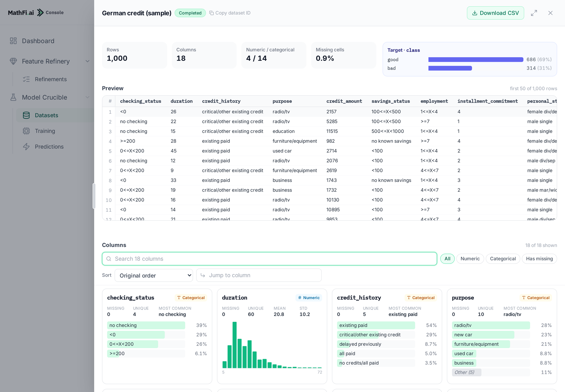
Every dataset in the MathFi.ai console opens in the Data Visualiser. It runs on the data you uploaded and needs no code and no notebook.
What we return
A profile of every column
Each column gets its own card: its name, its type, how much of it is missing and how many different values it holds. You see the whole file at once, not one column at a time.
Search the columns by name, filter them (all, numeric, categorical or with missing values), sort them and jump to any column. A preview shows the first rows of your data as the platform reads it.
Types and missing values
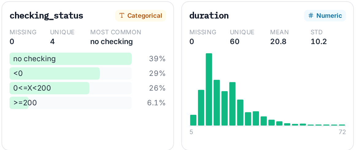
MathFi.ai marks each column as numeric or categorical. The summary at the top gives the share of missing cells in the whole file, and each card gives the share missing in that column.
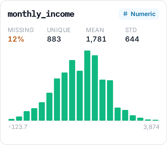
A column with gaps shows its missing share in amber, and a filter lists only those columns. Here, 12% of monthly_income is empty.
Distributions
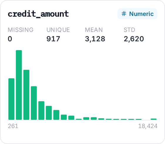
A numeric column shows its mean, its standard deviation and a histogram from the lowest value to the highest. A categorical column shows its most common values and the share of rows for each, with the rest grouped together.
You can see skew, outliers and rare values before any model sees them.
Target balance and top classes
When a dataset has a target column, the visualiser shows how many rows fall in each class, as a count and as a percentage.
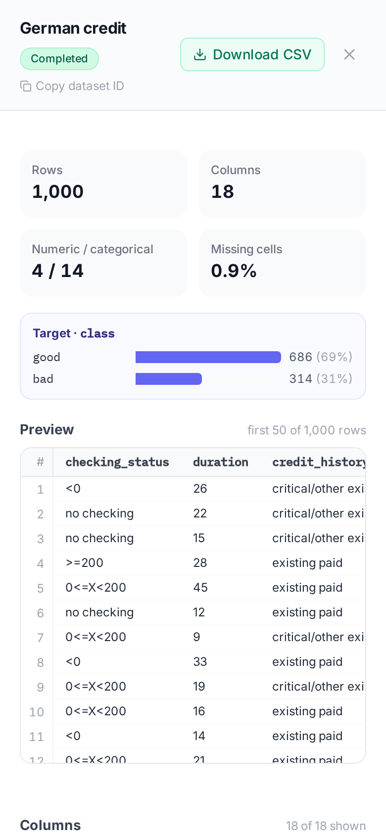
This is where a rare class shows up. Here, 31% of the loans are bad. If the class you care about is only a few per cent of the rows, you know that before you train.

On any screen
The visualiser works on a phone as well as on a desktop. The cards stack in one column.
Bring us a CSV and see what is in it.
Get started